Rumored Xbox Scorpio UI Sneaks Out of Microsoft Event

4.2
A possible Xbox Scorpio UI screenshot has apparently been leaked from Microsoft’s Build 2017 event in Washington state, showing off how the console’s dashboard will look when you start it up. The UI appears to be much easier to use than the original Xbox One’s own dashboard, and it’s translucent to boot.

This marks yet another piece of information about the Xbox Scorpio that we’ve gotten over the past few months. While it’s not as interesting to look at as the specs, it could be a step that Microsoft is taking to make the Scorpio dashboard easier to work with than the original Xbox One.

The possible Xbox Scorpio UI actually looks more fluid than the Xbox One’s dashboard. You’re able to switch to other pinned apps very quickly, and you can even do it, apparently, while playing a different game.

A significant problem with the Xbox One has been its UI, which many people have often criticized as obtrusive, unintuitive, and annoying to use in general. If the UI that we can see in the screenshot is actually a thing, we might also expect to see it on the regular Xbox One. Microsoft has often updated the Xbox One UI to make it better, so this isn’t really out of nowhere.

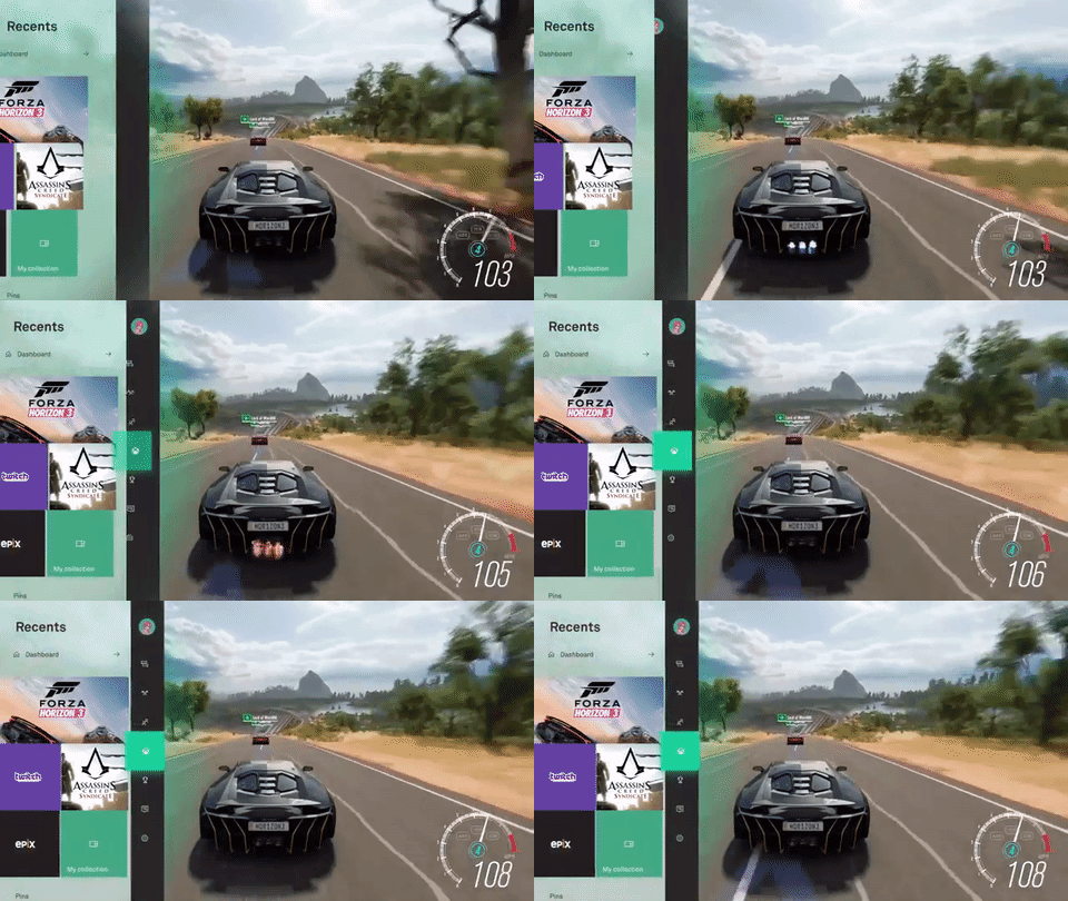


We’ll likely get to see if the possible Xbox Scorpio UI is legitimate when E3 rolls around, since that’s when Microsoft is most likely to reveal the Scorpio before its release in the later part of this year.

Posted:
Last Updated:
Related Forum: Xbox Forum

Comments

"Rumored Xbox Scorpio UI Sneaks Out of Microsoft Event" :: Login/Create an Account :: 17 comments

If you would like to post a comment please signin to your account or register for an account.

DusknoirPosted:

Ilcamorrista Stop teasing us and get E3 up and running! those clips look unreal!


The one gif is having a seizure

IlcamorristaPosted:

Stop teasing us and get E3 up and running! those clips look unreal!

TOXICPosted:

Hurry up E3 i wanna see some juicy information about this

HybridModsPosted:

Thank god I moved to Playstation. Xbox's UI has been garbage since 360. Wish microsoft would bring back the Blade UI

XboxPosted:

Eh I hope it's much better than this.

GrandmaArchyPosted:

lol, this is not a leak, this UI is already on Xbox One, they just made it "look" better with video editing to demonstrate what they were talking about. We've been able to switch to recent apps and pinned apps very quickly using the guide without leaving the game for a while. Are you guys out of date or didn't listen to the livestream? They are probably planning to make better animations for Xbox One in addition to apps like they were talking about, but I doubt Microsoft is good enough to be able to, they suck at animation.

16Posted:

ProJimmyRustler
Mitochondria doesn't look to special? Same nav bar style, and a little more in the sides rather then just lists/messages.

Waiting for E3 now.


This was more to show off the new Metro UI that Microsoft is adopting. I wouldn't expect the Scorpio to have a way different UI, since it is just a Xbox One with better hardware. They don't want to separate the two systems too much.


don't see how they are "adopting it" when they've used metro since windows 8 alone. For the most part you are right with it just being a better version of the original but still.

GMEPosted:

Cant wait for scorpio gonna be coping that as soon as its out!

BJPPosted:

Have no problem with the current Xbox one UI but the new one looks nice.

VHzPosted:

looks nicer but still seems annoying as hell. deffo need to get something like the 360 UI back.